How to create graphs in Excel
Graphs and charts make abstract numbers easy to understand. You can use bar graphs, pie charts and line graphs to compare data, emphasize trends and visualize facts. This is often necessary in Excel, which is commonly used to process huge amounts of data. For precisely this reason, the Microsoft spreadsheet application includes a range of built-in functions for presenting numbers and data sets in visually attractive ways. We’ll show you how quick and easy it is to create charts in Excel.
What are graphs in Excel?
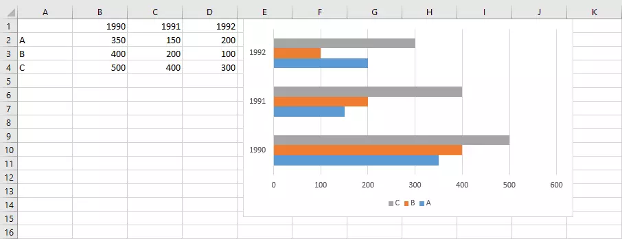
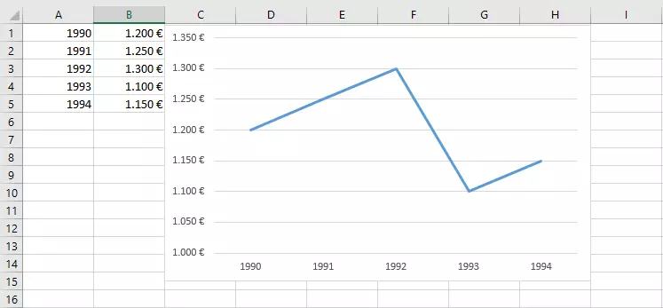
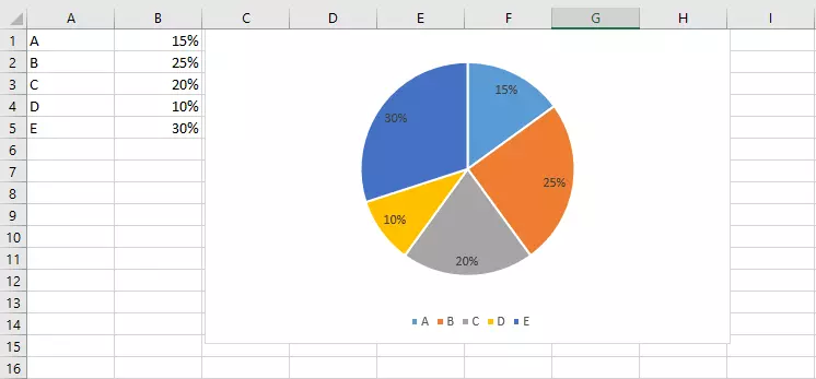
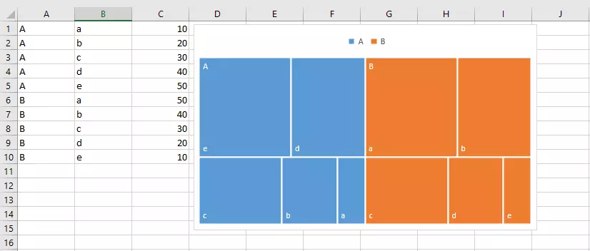
You can choose between different types of graphs in Excel. You use these to visualize selected data as clearly as possible. But not every graph type is suitable for all types of data. For example, pie charts can be a good choice for showing percentages, whereas line graphs are usually better for presenting data over time.
Columns/bars
Pie/donut
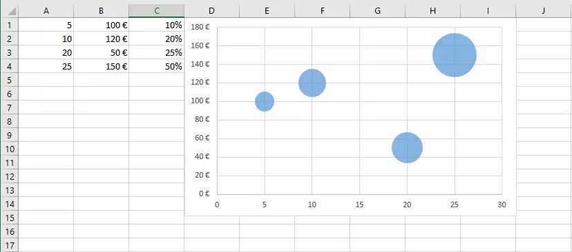
Scatter/bubbles
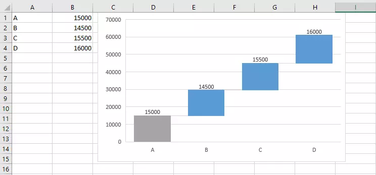
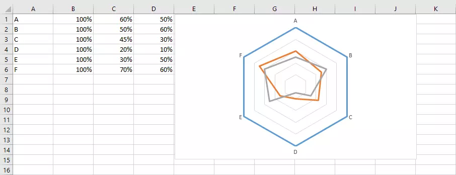
Excel also allows you to create slight variations of standard charts listed above. Charts with a three-dimensional effect are the most popular.
You can also create PivotCharts in Excel. These charts are also customizable, just like the pivot tables they are based on.
How to make a graph in Excel
First you need the data you want to present in your graph. Enter this data in a worksheet. Label your table correctly right from the start. This will save you time later because Excel automatically copies the labels to the graph. Next, select the range of cells you want to use in your graph. The range doesn’t have to be continuous. You can use the Ctrl key to select several smaller ranges.
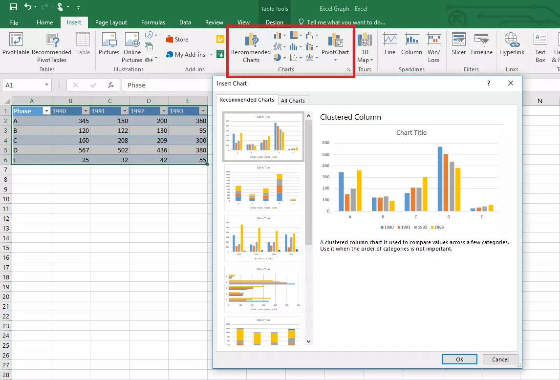
Next, go to the “Insert” tab. You can either select a graph type or let Excel pick one for you. Click “Recommended Charts” to see a list of graphs that Excel recommends, including previews with your data. In this window, you can also view all available graph types and select the one that’s best for you.
You can then move the graph to where you want it in the worksheet. You can also place your Excel graph in a new worksheet by using the “Move Chart” option on the “Design tab” in the Chart Tools section of the ribbon.
Adjusting a graph
The graph that Excel automatically creates for your will almost never suit your needs perfectly. You’ll probably need to make some customizations, even though Excel has already done most of the work for you.
Adding or removing elements
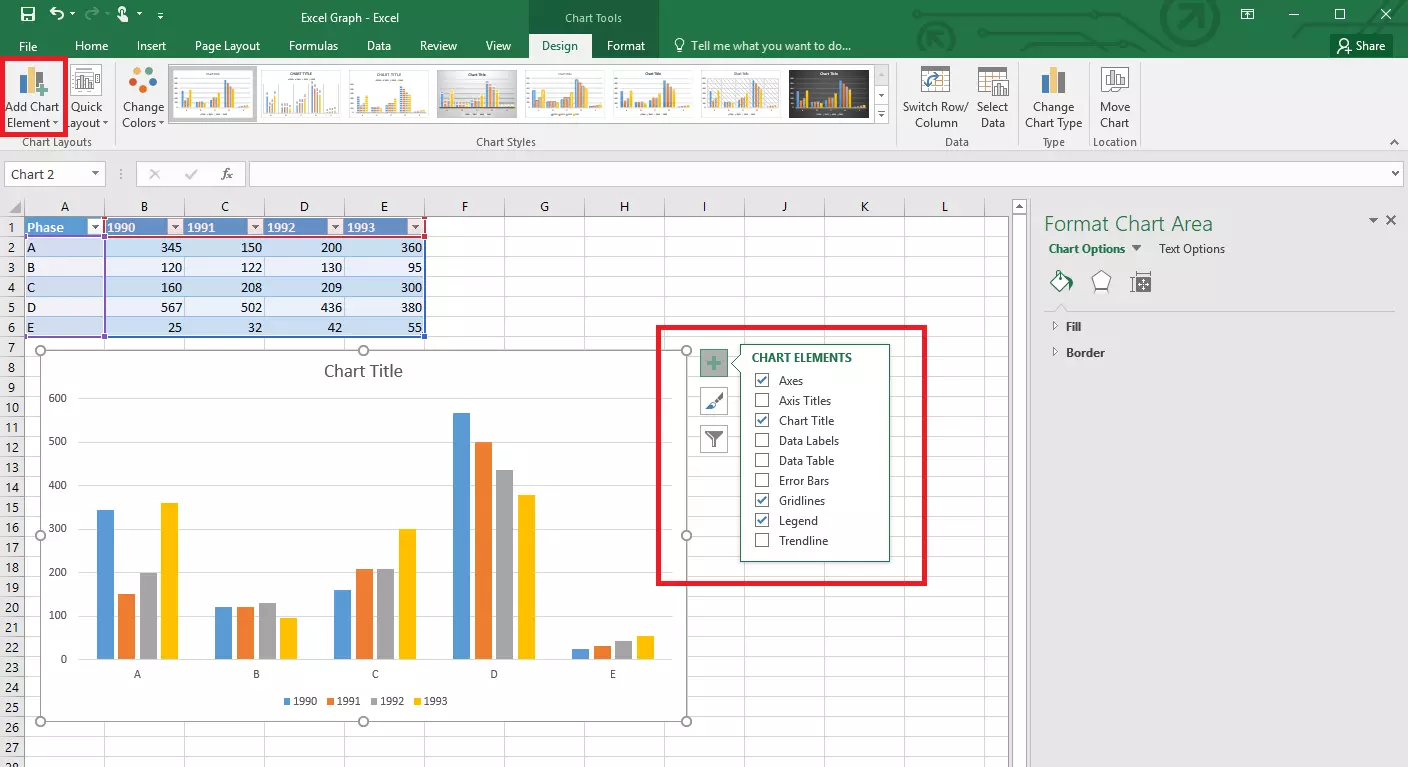
A standard graph in Excel consists of different elements. The actual graph representing the selected data is displayed in the middle. Further information is shown alongside it:
- Axis title: This label provides information about the values you’re showing.
- Chart title: A title ensures that everyone knows what the chart is about.
- Data label: You can also label individual values directly so that they’re easier to distinguish, especially in large charts.
- Data table: You can display the corresponding table directly within the chart as a visual aid.
- Error bars: You can display error bars in graphs to show margins of error and standard deviations.
- Legend: Use a legend to explain what the different colors inside the diagram mean.
- Trendline: You can add trend lines to your graph to show the direction of a trend.
- Up/down bars: Use this element to show deviations between different data series.
There are two different ways of adding elements to a graph. You can use the “Add Chart Element” button on the Design tab of the “Chart Tools” menu bar. Or you can click the plus icon directly next to the selected graph. You can then add or remove elements.
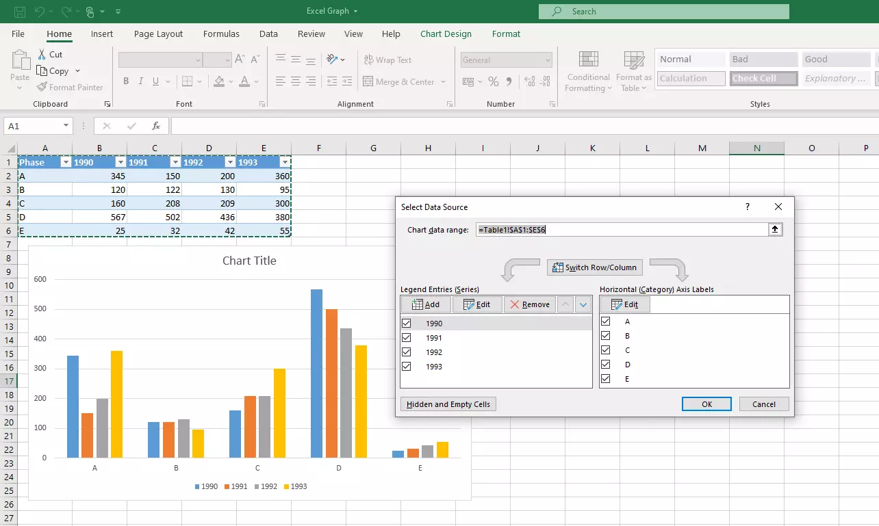
In addition to changing graph elements, you can modify the data in your graph after you create it. The Microsoft Office application gives you a range of options for doing this: On one hand, Excel charts are dynamic. When you change the data in the source table, the columns, lines or pie shapes in your chart will change too.
Alternatively, you can change the values selected within the graph: For example, you can choose the Chart Filters button (filter icon next to the chart) to show or hide data series and categories. Click “Select Data...” to display a dialog with several options for selecting the values. In this dialog, you can change the data range, add further series of values or switch the rows and columns.
Customizing the look
In many cases, you may want to adjust the layout of your graph in addition to the purely functional elements. For example, you might want to create a graph in order to present collected and calculated data to other people. Excel offers a range of options for adapting the layout to your corporate design.
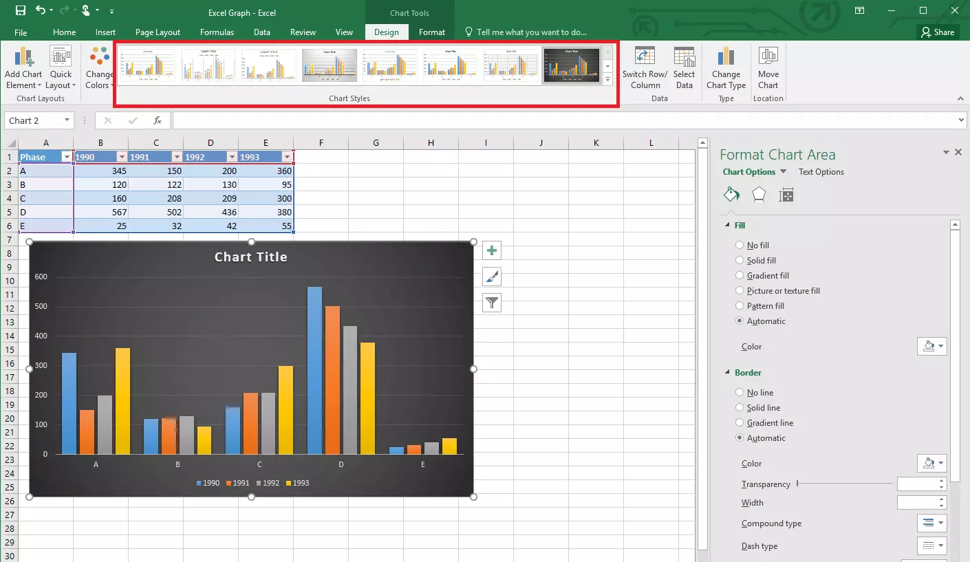
The first option is to choose from different predefined layouts. You can access these either from the “Design” tab in the “Chart Styles” section of the ribbon or use the paint brush icon directly next to the graph.
You can customize the appearance of your graph even further. Choose the “Format” tab to make a range of different settings. To display even more design options, right-click one of the chart elements and select a format option. This will open a sidebar where you can make extremely detailed customizations. You can change the font, color, border, fill and dimensions of all graph elements.
Want to use Excel but don’t have the Microsoft Office suite yet? Subscribe to Microsoft 365 with IONOS and start enjoying the suite right away on your PC or web browser.


