What is a landing page and how to create one that converts
The landing page is a key tool in online marketing, bringing together advertising and customer interaction in a single medium. It serves as the perfect platform to present offers directly to users and quickly turn them into customers.
What is a landing page and what is its purpose?
A landing page is a dedicated offer page that users reach after clicking on an online advertisement. These ads may appear in Google’s search results (SERPs), on banners, blogs, magazines, informational websites, or on affiliate partner sites. In online marketing, landing pages are widely used to guide potential customers directly to specific products or offers.
Good landing pages are optimally tailored to a specific target audience, content-wise optimized for search engines, and offer users attractive content. On the landing page, further information and so-called CTA (“Call-to-Action”) elements such as links, buttons, or contact forms encourage interaction with the provider or the execution of a direct transaction.
For online businesses, a landing page has two primary goals: driving conversions (transactions) and generating leads (contact with potential customers). Its purpose is to guide visitors straight to the intended offer and motivate them to make a purchase, download, or share their contact details. To succeed, the offer should be accessible within just a few clicks, allowing user actions to generate valuable customer data or direct revenue. When well optimized for targeted content and properly indexed by search engines, a landing page achieves higher rankings and greater visibility in organic search results. This makes effective landing pages a vital component of online marketing for any company.
What content should be included on the landing page?
A landing page is often the first touchpoint for users with a specific online offer. Unlike a homepage, it is not the start but rather the intended destination of the customer journey. When users click on an ad, they usually have a clear expectation that the landing page must fulfill. For instance, if an ad promotes “affordable men’s summer shoes,” the landing page should not display “trendy swimwear for men and women.” Forcing visitors to search further will quickly cause them to lose interest, as the page fails to match the original promise. To be effective, the landing page content must always deliver on what the ad communicates.
Regardless of whether you operate a magazine, blog, or online store, only relevant and valuable content will motivate users to accept an offer or engage with your brand. To achieve this, the landing page should directly address the most important user questions:
- Where am I?
- What do I get?
- How do I get it?
- What benefits does this offer me?
The landing page should address these questions through informative and engaging text and visual content even during the first scroll, highlighting its usefulness. Visitors need to feel they have found exactly what they are looking for. Text is the most important means of providing information. Appealing images and explanatory videos help to optimally present the offer.
The content of the landing page must be well-prepared and clearly structured. Concise, understandable, and error-free text conveys credibility, expertise, and quality. Each section requires a meaningful, catchy headline and short informational blocks with subheadings, providing a comprehensive impression in the shortest time possible. Suitable imagery (“Hero Shot”) enhances this effect.
The order of offering information on the landing page should be arranged by descending importance as users scroll down: Common customer questions are addressed first, while rare or specific queries come last. However, for search engines to discover and positively rate the content, it’s essential to deploy a judicious and logical approach. A few lines of continuous text, well-organized lists, and offer-relevant keywords succinctly and effectively describe the features, customer benefits, and the company’s expertise before prompting action.
- Intuitive website builder with AI assistance
- Create captivating images and texts in seconds
- Domain, SSL and email included
Call-to-action and legal notices on a landing page
Prominent CTA buttons should be placed throughout the text so users can instantly take action—whether that means making a purchase, downloading content, or submitting their contact details. Including testimonials from satisfied customers or partners can further strengthen trust, but the information must remain reliable and authentic. The landing page should create the impression of a customer-oriented specialist shop rather than a discount bin.
The key is not to overwhelm visitors with numerous offers, but to highlight one clear proposition. Since attention spans are short, users are more likely to complete a form, download, or purchase when the page is focused, engaging, and makes them feel supported.
In addition to the offer itself, certain legal details should also be included on a landing page. At minimum, this means providing a clear privacy policy that explains how user data—such as names, email addresses, or payment information—is collected and used. It is also highly recommended to include terms and conditions that outline rules of use and limit liability, as well as disclaimers where appropriate (e.g., for financial or medical content). These details should be linked clearly and be accessible from every subpage—including landing pages—to ensure transparency, build trust, and comply with applicable U.S. state laws such as the CCPA/CPRA in California.
For lead generation, it’s considered best practice to use a double opt-in process especially for newsletter sign-ups or registrations. In this approach, users confirm their subscription via email after submitting their details, which helps ensure valid consent, improves list quality, and reduces spam complaints. While U.S. law (CAN-SPAM Act) does not require double opt-in, it does require clear opt-out options and honoring unsubscribes promptly. Using double opt-in adds an extra layer of trust and helps keep your email marketing fully compliant and effective.
Structure and design
The best content loses its value if it’s poorly presented. For landing pages, as for websites in general, usability is crucial: visitors should immediately understand the offer and navigate without effort. The structure and design need to capture attention, provide essential information, and guide users directly to their goal.
If the page feels cluttered, visitors may abandon it quickly. High bounce rates and short visits not only block conversions and leads but can also hurt search engine rankings. That’s why key information should be placed clearly, concisely, and in well-structured blocks.
A strong landing page is not abstract art but a clear, appealing, and goal-oriented offer page. Visual design should support the message—attractive yet not overloaded. Colors and images must harmonize with the offer and align with the corporate identity (CI). Even a conservative CI should avoid being too dull, while artistic designs must not appear chaotic or overwhelming.
Ideally, the landing page reflects the look and feel of the original ad—color scheme, fonts, and imagery should remain consistent. For mobile optimization, a responsive or adaptive design ensures usability on smartphones and tablets, improves user experience on the go, and benefits search rankings.
Arrange the content so the offer is accessible without excessive clicking or searching. White space helps create clarity and balance. Depending on content density, placing all essentials within the first screen view can prevent unnecessary scrolling. The ideal landing page follows a simple formula: compact, fast, and clear.
- Introduction: Logo, headline, and introduction with a representative image
- Product description: Key information, unique selling propositions (USPs), price, benefits, functionality
- Call to action with text and/or image
- References: Testimonials, certificates, proof of quality
This is not only about aesthetics—too much data, oversized images, unnecessary plugins, or irrelevant extra features can slow down landing page loading times and even trigger errors that drive visitors away. To ensure strong performance, the page should be regularly updated and optimized using data analysis, A/B testing, and error checks. Only by understanding which elements truly resonate with the target audience can a landing page be designed to remain efficient and profitable over the long term.
Examples of good landing pages
Here is an exemplary selection of well-ranking landing pages:
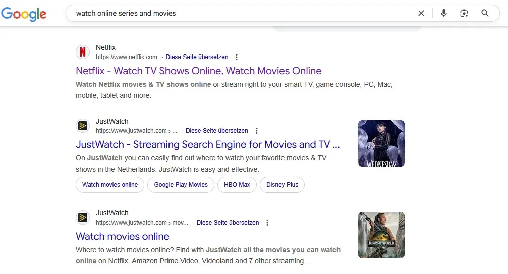
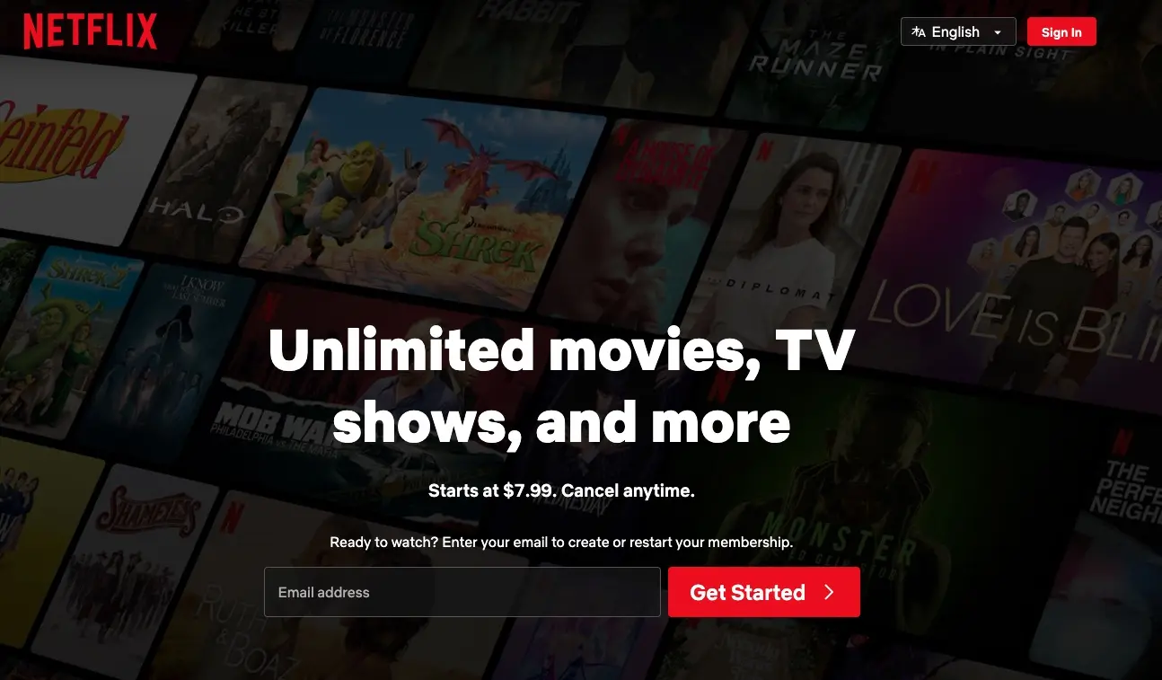
The streaming provider Netflix clearly and attractively explains its offering:
- Headline: “Unlimited movies, TV shows, and more”
- Subline: “Starts at $7.99. Cancel anytime”
- Company logo: Placed visibly at the top of the page
- A clearly visible call-to-action provides a clear incentive to act: “Ready to watch? Enter your email to create or restart your membership.”
Lower on the page, the key incentives and conditions are presented in a clear list. A headline such as “More Reasons to Join” introduces the section, while short sublines provide concise explanations of the benefits.
- Enjoy on your TV
- Download your shows to watch offline
- Watch everywhere
- Create profiles for kids
Additional information becomes visible as you scroll down:
- FAQs: Frequently Asked Questions
- More CTA buttons that invite clicks
- Additional links, e.g., to the Help Center or account settings
The look is organized, with subtle colors, and provides ample space for navigation.
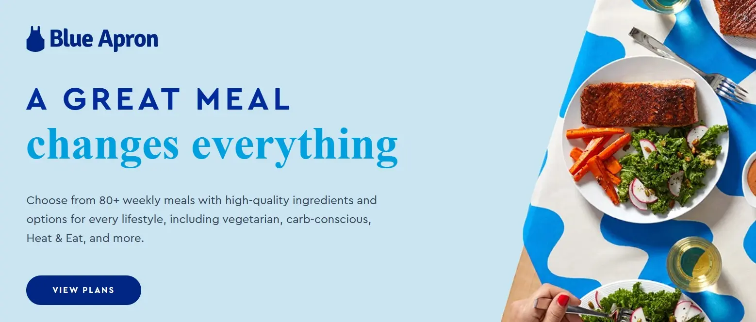
The Blue Apron Cook landing page is effective because it delivers a clear value proposition right away, highlights transparent pricing, and repeats key benefits such as flexibility, convenience, and quality ingredients throughout. Prominent CTAs like “View Plans” guide users directly toward conversion without distractions, while simple visuals, icons, and clean design ensure readability and mobile-friendliness. By addressing common customer concerns—cost, time, ease, and flexibility—it reduces friction, builds trust, and makes the next step obvious, which is why it works well as a conversion-focused landing page.
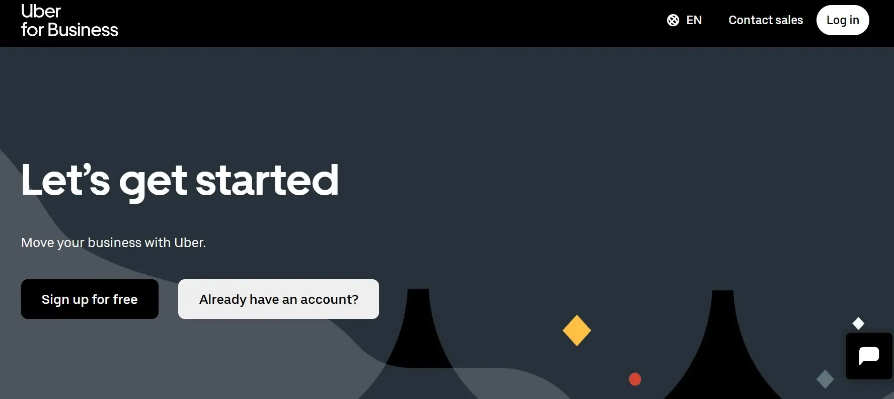
The Uber for Business sign-up page works well as a landing page because it combines clarity, focus, and ease of use. It starts with a direct headline and sub-headline that explain exactly what the service is about, followed by a clear “Sign up for free” CTA that lowers the barrier to entry. The page highlights benefits tailored to business users—like saving time on expense reporting, coordinating rides and payments from a single account, and driving customer engagement with vouchers—which makes the value proposition highly relevant. The design is simple and uncluttered, keeping the focus on conversion, while reassurance elements such as legal links, privacy policies, and language options build trust and accessibility. Altogether, it effectively addresses key business pain points while guiding visitors toward the next step without distraction.
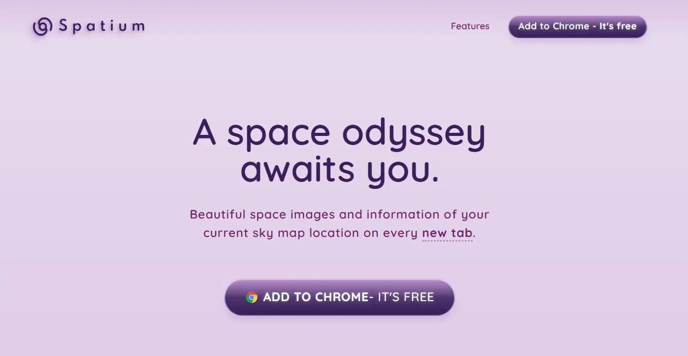
The spatium.earth landing page makes a strong impression with its clean, modern design and focus on simplicity, which immediately draws attention to the core product. By avoiding clutter and distractions, it keeps the user’s focus on the main offer and creates a smooth, visually appealing experience. The minimalistic layout communicates a sense of quality and professionalism, which builds trust and makes the concept feel accessible. This clarity and focus ensure that visitors quickly understand the product’s purpose and are guided toward the next step without unnecessary detours, which is what makes it a good landing page.
All four landing page examples have one thing in common: their offer information is concise and focused, the content is clearly structured, and the CTA elements are placed prominently for maximum visibility. Together, these features make the pages highly effective in fulfilling their purpose.
- Professional templates
- Intuitive customizable design
- Free domain, SSL, and email address
