Google search results: the evolution of the SERPs
In little under 20 years, Google has transformed from a small garage company with a handful of employees to the ultimate global business empire. Alongside its numerous side projects in other industries and fields, Google remains the market leader with its initial entry product: the online search engine. Since the Google search first went live back in 1998, the company has developed into the most valuable brand in the world. And the aim is still just the same as it’s always been: to show the user the most relevant search results possible. But what has changed is the type of information Google users require and with it the technical challenges of the search itself. If you compare the original Google search engine with today’s functions and features, you’ll see the incredible amount of change that has occurred. We’ll take a look at the Google search results from previous years compared to today and show you the most important changes to note.
Aim: a quick and accurate search engine
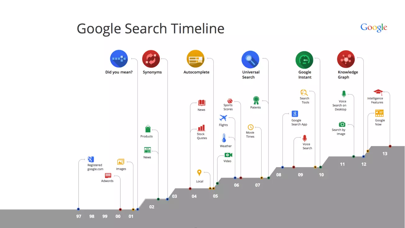
Right from the start, Google’s aim was always to develop the quickest and most precise web search in the world. And for almost two decades, the company has continued to focus on improving its searches and offering its users the best and most relevant results possible from across the web. One way of improving is the continuous further development and adaptation of the basic search algorithm. In our overview of the most important Google updates, you’ll find a list of all the most important steps that have fundamentally changed the way Google’s search engine works behind the scenes. These developments are very important for all website operators – both the Panda and Penguin updates have massively changed the work of online marketers, particularly their SEO tasks. The updates also indirectly affect the user as well, of course, as it means all Google customers can expect ever-improving search results. Google has continually succeeded in its attempts to understand the user better, and the Hummingbird update was its biggest breakthrough in this regard, with the establishment of what’s known as the semantic search. But instead of looking at the technical aspects of the different updates, we’re focusing on the search engine results pages, or SERPs. How have Google’s SERPs changed? Which additional elements have been added over time? The graphic below offers a nice overview of Google’s development from registration of the Google domain right up to the search engine we all know today:
1998: The first search engine results page
The Google online search came into operation in 1998. This was precisely the right time too, as the turn of the century saw an explosion in the number of websites. With such a dramatic influx of information, it became increasingly difficult to find content that was actually useful for users. For this reason, Google’s founders Larry Page and Sergey Brin developed their PageRank algorithm, designed to tackle this problem by ranking websites in the SERPs based on relevance to the search.
The screenshot below shows Google’s search results for a search from 1998, the year of its foundation:
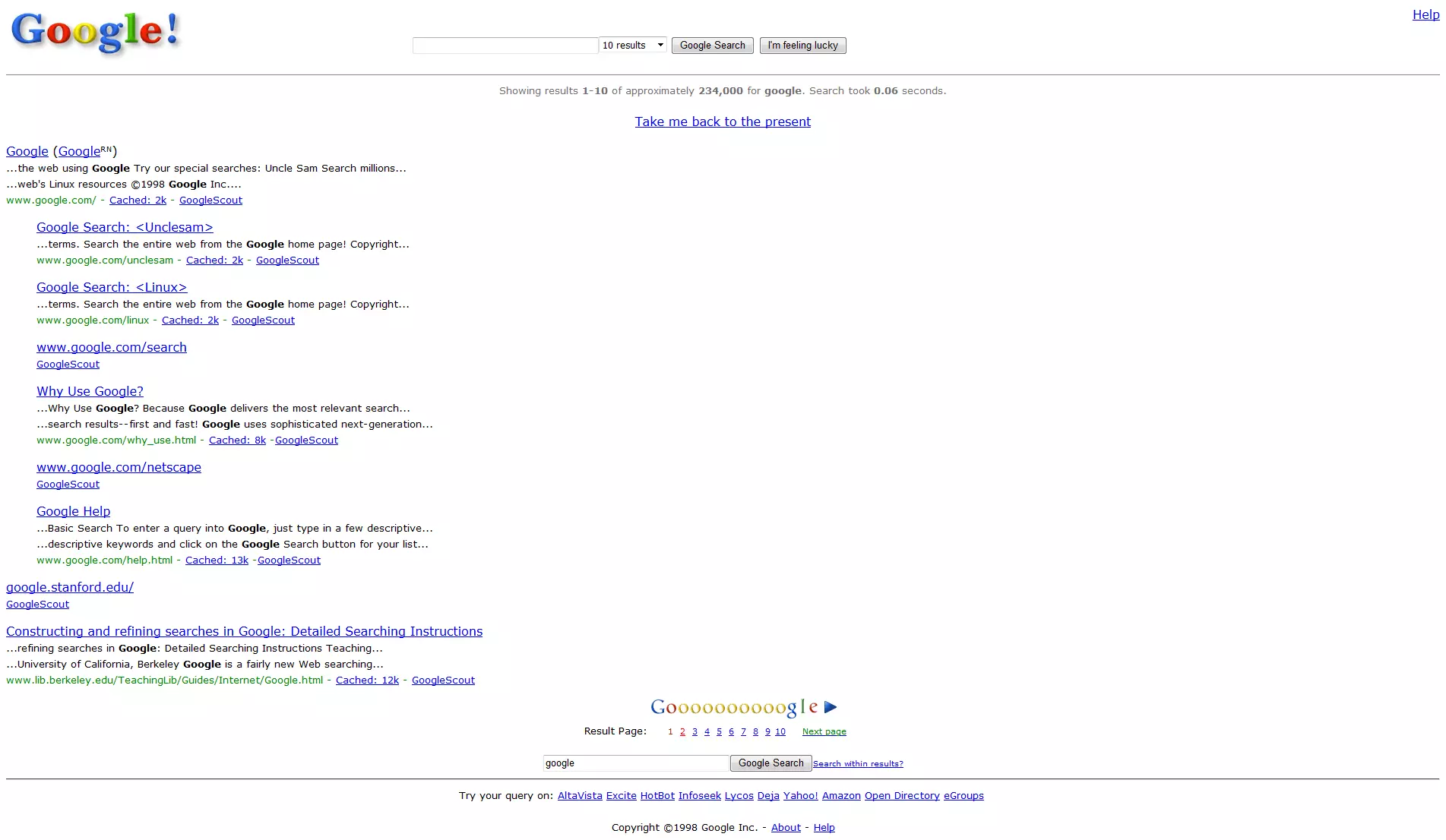 Maxx-Studio
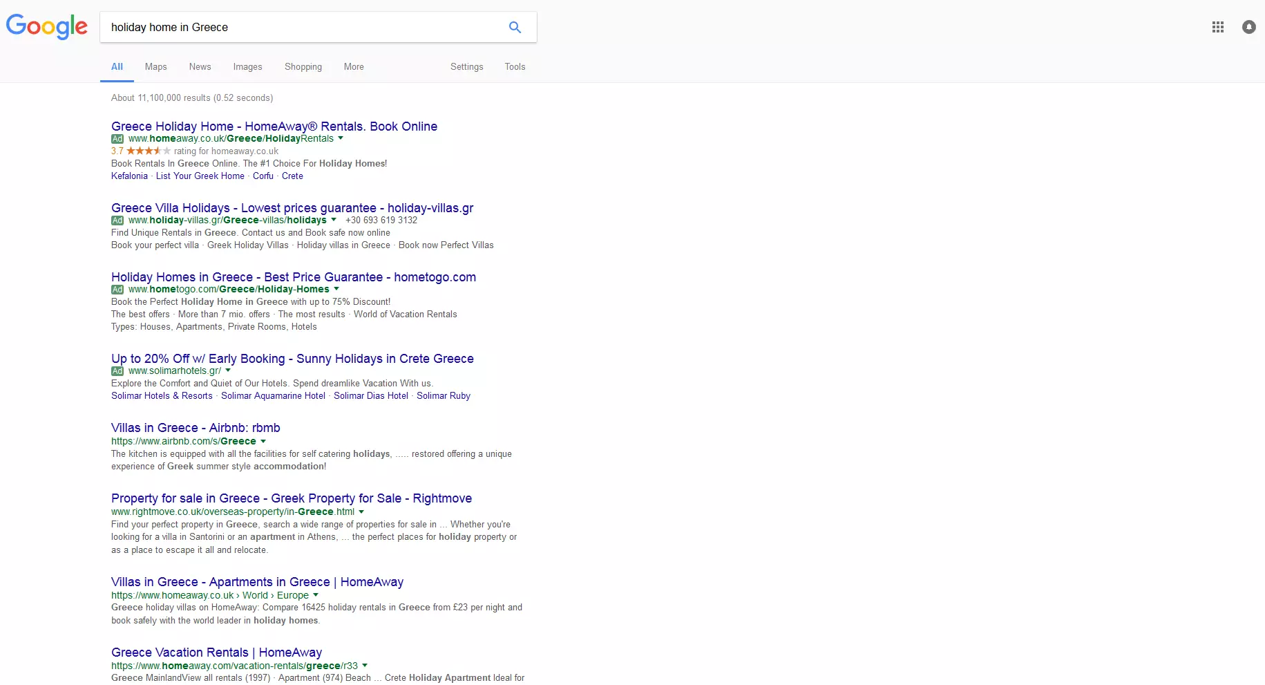
The screen capture above shows how Google only offered organic search results at the time. Until just a few years ago, Google only displayed up to ten search results on a specific page. As the image below shows, the look and layout of the Google SERPs has changed a lot:
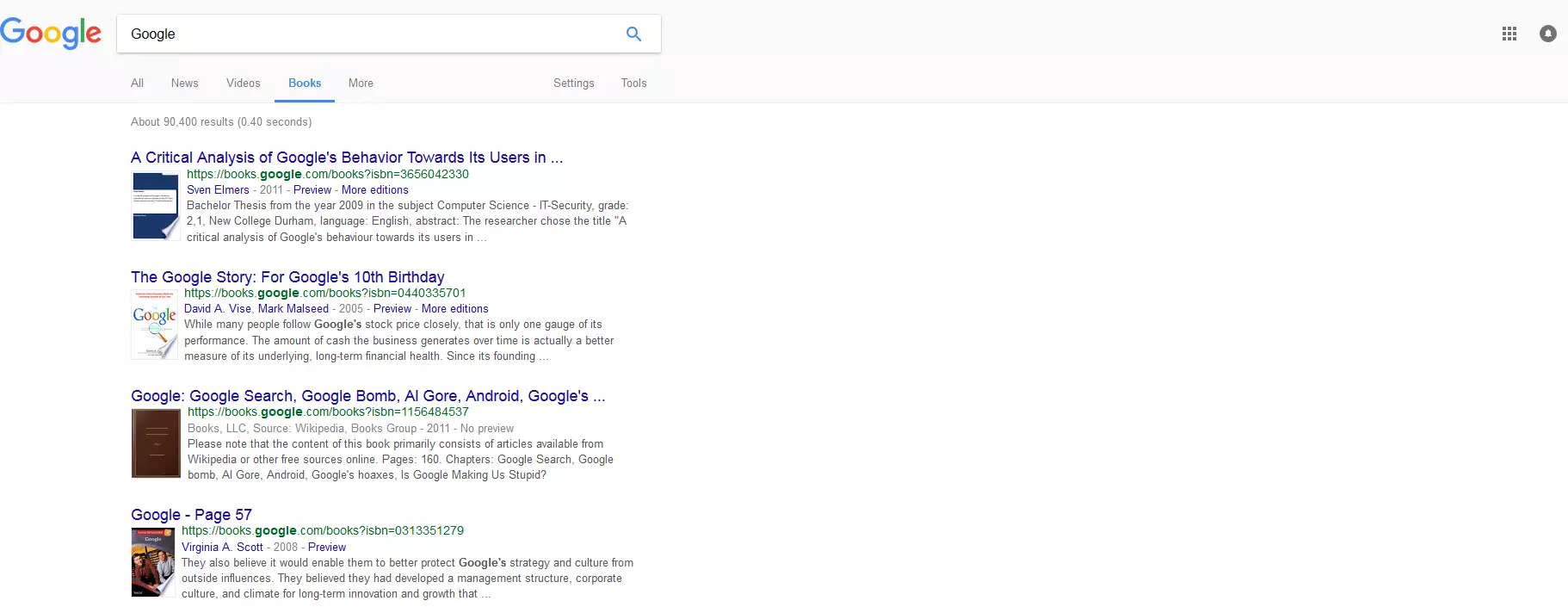
This change is in part down to the numerous extra features and additional information that Google has gradually integrated into its search results pages. By doing this specific search for Google itself, you can see that along with the organic search results, users also receive search results from Google News as well as the so-called Google Knowledge Graph. Additionally, the SERP display has been changed greatly by the introduction of Google AdWords. This has meant that certain searches (particularly ones for products or other commercial sector terms) only garner between 4 and 6 organic results, with the remainder of the list comprising advertisements.
Speaking of search engines, can your website be found on Google? Make sure your SEO is up to speed and optimize your website with rankingCoach from IONOS!
2000: Invention of Google AdWords
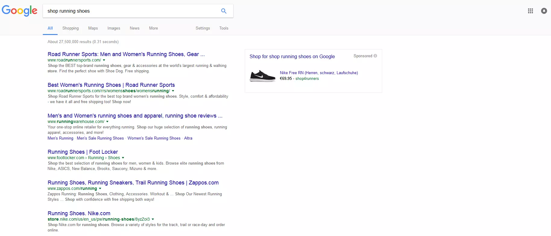
Until the summer of 2000, Google was still entirely free of ads. The competition had already begun to integrate banner display advertisements into their search engine results. But it wasn’t until midway through this year that they launched the now world famous Google AdWords. The developers have one basic requirement for the display ads: they should be just as relevant to the user search as all the other Google search results. The user should also always have the option to decide between the paid ad displays and the organic search results. This principle has always remained the same, even though the quantity, identity, placement, and design of the AdWords display ads has been changing regularly since its creation. Just as before, Google continues to show the display ads in the upper half of the SERPs, above the organic search results as well as in a separate, private area on the right hand side. Some AdWords display ads are also shown at the bottom of the page, underneath the organic search results – but there are never more than a maximum of four ads displayed within the search results (combined total of ads displayed above or below).
The right column of ad results have become less important for advertisers, partly because of the Knowledge Graph (see below) but predominantly because of the increased use of mobile browsing. When displayed on a mobile device, the right site of the page isn’t visible due to the narrower display.
For this reason, most ads are displayed in the main, left-hand column. The exception to this is for shopping ads, which are sometimes still found in the right-hand column for online shop products:
2001–2007: from a simple web search to Universal Search
Of course, it’s not just the invention of AdWords that has caused changes between the original version of the search results and the modern Google SERPs we’re all used to seeing today. The new Google search results have developed from a simple search for web pages to a universal search (known as ‘Universal Search’) for all online content.
The following video offers a good overview into the development of Google over the years:
 To display this video, third-party cookies are required. You can access and change your cookie settings here.
The invention of the vertical search engine and Universal Search is a key factor in explaining how Google was able to become the universal and most used search engine. Some of the most important vertical search functions include:
- Maps
- News
- Videos
- Images
- Shopping
- Books
Users can enter their search term(s) on the vertical search engine and receive targeted results for specific topics or application uses. And certain requests will lead Google to display the vertical search results directly in the central Google SERPs too. Other additional features to the ones mentioned above include instant results for searches for sports results, weather information, flight times, and apps. There’s even a feature for browsing international patent databases.
There’s one central goal that remains the focus of the Universal Search program: Google wants to provide the appropriate search results regardless of the type of content required – the only prerequisite should be that this content can be found somewhere on the World Wide Web. But at the same time, the search should be made as simple and fast as possible for users. Google has sped up and simplified the process of web searches several times in the past few years with many new features and functions, including:
- Google Instant (results are displayed during the typing process)
- Google Suggest (search terms are predicted and offered in real time)
- Improved interpretation of search queries
- Advanced search
- Alternative suggestions
- Autocorrect for spelling mistakes and typos
- Inclusion of synonyms
- …and many more
Since 2008: Ever-improving processing of information
Google has developed into an incredibly complex, universal search engine. In order to help sort the immense amount of information and data required for the millions of daily searches for documents and content on multiple devices, Google has come up with many new methods for information processing over the past few years.
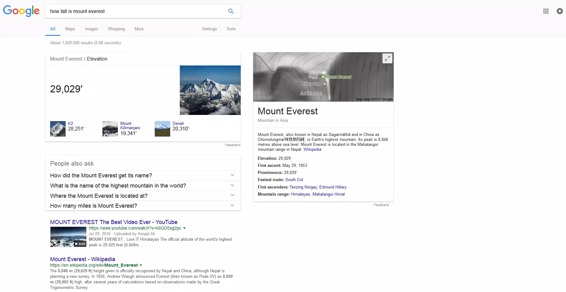
Quick Answers
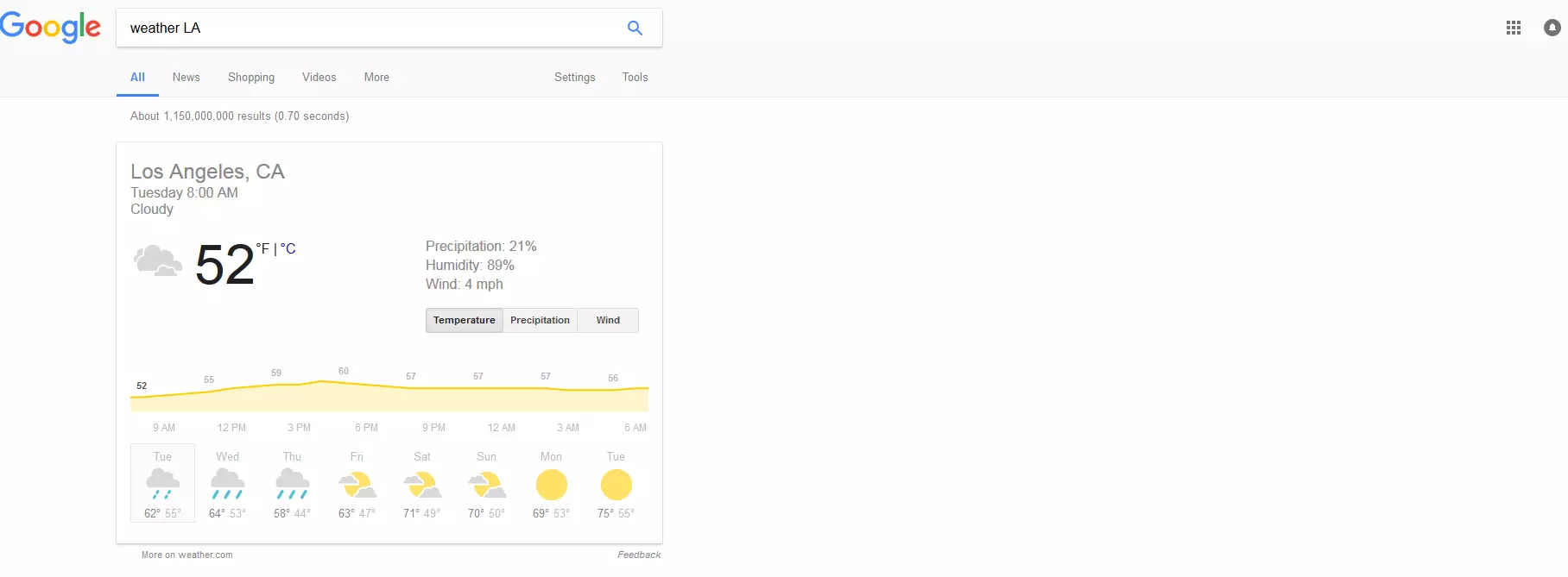
A similar function is also available when it comes to answering queries about the weather. By searching ‘weather LA’, users immediately receive Google’s weather service prognosis, as powered by weather.com, as an overview for the coming week:
Knowledge Graph
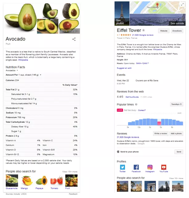
The Knowledge Graph offers users structured and detailed answers on the search engine results page itself. Facts about people, locations, or objects are presented by Google as an overview in a separate field on the SERPs. The examples below show just how much these overviews can vary. In the first example, a user search for avocado offers a full list of nutritional facts about the fruit. In the second, a search for the Eiffel Tower in France offers historical data and facts about its architecture and visiting times.
Carousel
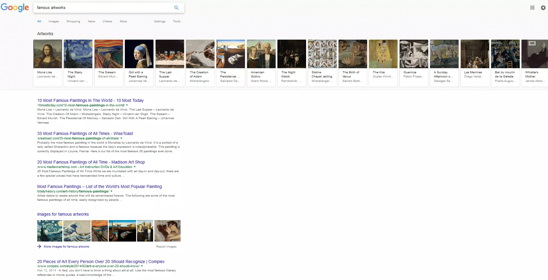
When the Knowledge Graph is displayed, it’s often accompanied by the Carousel display too. The Carousel is a row of images that are semantically relevant to the Google search results and offer additional information to scroll through. The intention here is to offer users information and connections to their search term that they perhaps wouldn’t otherwise know to search for.
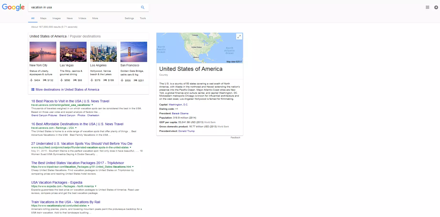
Recent tests on Google search results
Google regularly changes its search results and tests these changes on small user groups before the SERP updates are rolled out for all users. In the past few years, individual user groups have received a preview of:
- Google search results displayed in two columns
- An integrated search function for the SERPs
- Paid ads in local search results
- A timeline as an extension to the Knowledge Graph
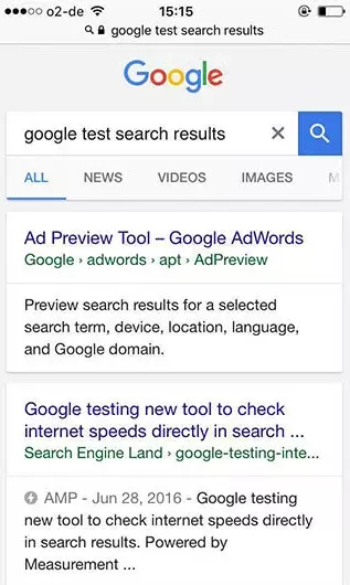
In all of the above examples listed, the tests results led to the ideas being revised or scrapped. In some cases, only text colors, sizes, or formats are changed in the Google SERPs. Some of the changes to the Google search results also have an impact upon search engine optimization. One procedure that’s always particularly hair-raising for SEO departments is making sure the title and description length of web pages display properly on a Google SERP. As of May 2016, testing began on the possibility of longer text displays in the Google results pages. If the search engine leader decided to change the ‘search snippets’ for all users, website operators will have their work cut out when it comes to deciding what to do with the extra space, for example including a CTA (Call to Action). At present, Google is testing changes to its design and its structuring. And it appears as if the changes are going to focus on making the desktop version fit better for searches on mobile devices. As you can see in our screenshots above, the new look will bring a typical mobile feel to the desktop display – with the right-hand column used rarely. Since desktop display screens are much wider than the displays on mobile devices, this looks slightly unusual at first glance. This new, condensed display means that the Knowledge Graph will move from the side to underneath the search results on mobile devices. But on a desktop, this creates a lot of white space for the user and involves more scrolling. Another change is that the Google search results will be displayed each on a separate card, similarly to the mobile display in the example below:
This will lead to a better optical separation of the individual search results, giving the user a clearer picture of the variety of results, particularly for results that include images and category links etc. Whether Google decides to implement the changes seen in the testing phase for all users is currently still unknown. Meanwhile, mobile searches will move away from the standard results as displayed above and be presented as ‘rich cards’.
Google search results: no standing still
Google has always been at the forefront of reinvention, and the search engine giant shows no signs of running out of new ideas for improving the optimization of its search engine results pages in the future either. You can expect many more developments and updates in the coming years. For marketers, this means one crucial thing: always keep up with Google. This is particularly important for SEA departments. If the most recent changes to AdWords displays are anything to go by, then click price is surely destined to go up – at present, the trend is for fewer and fewer ads to be displayed on each SERP, meaning the top places are more coveted than ever before. This should lead to the interplay between SEA and SEO becoming even more intertwined in the future – neither channel will really be able to function properly without the other. It will also remain interesting to see how the size and appearance of the Google search results will develop in the coming years – particularly in relation to the growing importance of the mobile search. In the second part of this article about the evolution of the Google SERPs, we’ll explore mobile search results and introduce the newest tests being carried out on the Google search results as well as looking at further current developments.


