Quick and easy mobile optimized websites
- Internet & email address included
- Always up-to-date
- 24/7 customer support

Create a mobile optimized website
Why is it important to create a mobile website?
Smartphones, tablets, and other mobile devices are steadily gaining popularity. More and more people use a mobile device to access the internet. It is often quicker to look something up using your smartphone or tablet than to start up your computer. The technology for mobile internet like 3G or LTE is constantly improving too, making surfing the internet on the go an attractive option. As a website owner, it is important to adapt to this trend quickly by creating a mobile version of your page.

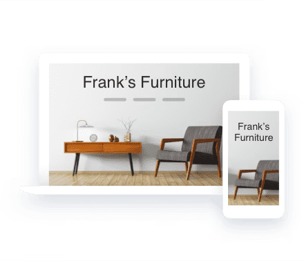
Optimized for all devices
Design templates
Device View
Contact information at your fingertips
Choose how you want to build your website
All features at a glance

Only at IONOS
Your personal consultant
Not only do you get the latest AI tech, but you also get your own personal consultant to guide you every step of the way.
24/7 expert support
Technical questions? Our award-winning experts are always available to help by phone, chat or email.
Benefits of mobile optimized websites
Mobile optimized websites increase user-friendliness
Creating a mobile version of your website has multiple advantages when it comes to user friendliness. For example, your content will be adapted to the screen size of the user's device, be it a smartphone, tablet or laptop. Text, pictures and navigation are all automatically adjusted to the right size. Another reason to optimize websites for mobile devices is that it decreases loading times.

Creating a mobile website
Every year, mobile internet access increases and more people want to know how to make their own mobile website for free. The use of smartphones and tablets is particularly quick and easy. There are a multitude of devices available today all with different display sizes, which presents website owners with a new challenge. The displays of mobile devices are significantly smaller than computer screens, which makes technical innovations necessary to ensure that websites can be viewed properly. IONOS MyWebsite allows you to create a mobile website with the click of a mouse. The settings can be changed and your website customized at any time. Responsive web design optimizes your content for the respective device. Tables with multiple columns may look well-structured on a computer screen, but involve a lot of scrolling on smartphone screens. With our responsive design, your content is tailored to the display size of the device. With IONOS MyWebsite, integrating the latest trends into your web project is child's play.
Design is without a doubt one of the most important aspects of a website. It provides the external packaging for the content and plays a decisive part in leaving a strong first impression on the user. Furthermore the design can influence the functionality of the website. With the IONOS MyWebsite free mobile site builder you can choose between many different design templates, which you can then customize according to your taste and the requirements of your website. Many templates available to you as a new customer are suitable for a responsive layout. If you select the relevant option, the content of your page will be optimized for various devices. Whether smartphone, tablet or desktop — your page is displayed perfectly. Creating a website version for mobile devices is no problem with IONOS.
Yes. If you have been a IONOS customer for a while and set up your website before smartphones and tablets became commonplace, you may have chosen a template that isn't responsive, leading to problems when displaying the page on a mobile device. The consequence: the user has to resort to scrolling and zooming to view the relevant information. Changing to a responsive layout is absolutely no problem, simply choose one of our new templates in the mobile friendly website builder and your page will appear in its new design and is immediately optimized for mobile devices. Only a few of our older web apps may have some complications as they are not yet supported. These may not be displayed after changing to the responsive layout.
 Create a business website
 Website with your own domain
 Free Domain Name
 Email hosting
 Webspace
 .com domain