

Graphical User Interface

Web designers and software developers will stumble upon the term 'user interface' sooner or later. The abbreviations associated with it, such as UI, TUI (Text User Interface) or GUI (Graphical User Interface) can be confusing. The latter is especially important for a good user experience — whether on a website or dealing with software. But what exactly is a user interface? And why is a graphical user interface so important for a website’s success? Our guide provides you with the basic info on good UI design and answers the question of what user interface actually means.
What is a UI?
A user interface (often abbreviated to 'UI') refers to the interface through which people interact with machines. It is the interface that allows you to operate the computer, place an order in an online store, or use an app on your smartphone. The user interface includes all operating elements that the user sees or interacts with. This can range from simple text-based command lines to elaborate graphical user interfaces. At the same time, the UI enables the machine to send feedback to the user so they can see if their action was successful or not.
The user interface depends very much on how easy it is to operate a piece of software or website. It is no longer simply a question of creating a user-friendly user interface: aesthetic aspects are also gaining importance. The user interface is necessary for a good user experience — meaning the overall experience a user has with a website or software. The aim of every web designer is, therefore, to lay the foundations for a good user experience with an intuitive user interface. This works best with a graphical user interface. But other types of UIs are also useful for facilitating interaction with computers and other devices.
What are the different kinds of UIs?
Since the computer was invented, more and more methods of computer interaction have been developed. There are now several different types of user interfaces. At the beginning of the computer era, there were simple Command Line Interfaces (CLI), but many technical innovations have led to easier or more direct usability so that Natural User Interfaces (NUI) have been used for a long time. Even controlling devices by measuring and translating brain waves is now possible. Here are the most important UIs and their features at a glance:
Command Line Interfaces (CLI)
At the beginning, the UI was desolate and empty. Only one command line and a prompt to display the current position, or a command prompt, was present on a dark screen — for example, the first MS-DOC computer. After entering a command, a Command Line Interface was used to communicate with the computer. After this request was processed, the result was displayed — also in text form, of course. This form of user interface is now regarded as obsolete but is still used with cmd.exe in Windows operating systems, where the syntax is largely oriented to the DOS ancestor. Control via CLI takes place exclusively via the keyboard; a mouse isn’t used.
Text User Interface (TUI)
Text User Interfaces are somewhat more convenient. The interaction with the computer takes place solely via keyboard here as well. The TUI marks the transition from pure Command Line Interfaces to graphical user interfaces: the concept was established only after the development of graphical user interfaces so that text user interfaces could be defined conceptually from CLIs and graphical user interfaces. Therefore, the term is a retronym.
The difference between TUI and CLI is that the interface uses the screen in a two-dimensional way rather than line-oriented. However, as the name suggests, the interface continues to run in text mode. Programmers typically have 256 characters. TUIs are still used today — for example, with bootloaders or BIOS setup programs.
Graphical User Interfaces (GUI)
Graphical user interfaces are now the established standard. Nowadays, software is operated by graphical controls and symbolic images that are often designed to be objects from the 'real world'. It’s normal for a user to employ his or her mouse and keyboard as a control device but touchscreens are now becoming more popular. With the graphical user interface, icons have also moved into the digital world — such as the desktop, individual windows, and the trash can. The desired elements can be selected using the mouse or by tapping on the touchscreen.
The graphic design is mostly based on the traditional analog office. The result: all elements can be easily identified and the operation is more intuitive than using Command Line Interfaces. Even inexperienced users can understand the functions of the icons quite quickly since neither a trash can nor an envelope icon (used to symbolize the mail program) needs any further explanation. These symbols have now become standard for user interfaces as well as the GUIs themselves: there aren’t many graphics programs whose tool icons do not symbolize actual objects such as brushes, pens, and erasers.
Voice User Interface (VUI)
Even though graphical user interfaces are found almost everywhere, the development of the user interface with GUIs is still ongoing: when it comes to Voice User Interface, you can also interact with machines using voice commands. Every current operating system now offers UI in one way or another: Apple has Siri, Microsoft has Cortana, and Google has its own search form with voice input. Since applications are opened by voice commands and spoken text is automatically coded, it means that users can work more effectively. A further advantage: voice commands provide more accessibility.
Natural User Interface (NUI)
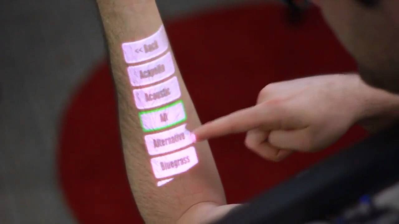
Communication with the machine is even more intuitive when a Natural User Interface is used: the NUI is considered as a further development of the graphical user interface and the Voice User Interface: the interactive user interface reacts to gestures as well as movements and speech. In addition, it also focuses on facial and object recognition. Various sensors, cameras, and microphones are used to communicate with the machine. Many current smartphones and tablets are becoming increasingly based on NUI technologies but Nintendo’s Wii console also makes the most of gesture, face, and speech recognition.
In 2011, a project presented by Microsoft created a stir: technology was developed under the name OmniTouch that made it possible to project touchscreens onto every conceivable surface. OmniTouch is based on Microsoft’s motion control, Kinect, which was put on the market to compete against Nintendo’s Wii. In addition, a laser-based projector and a special camera were used. This particular form of Natural User Interface is also developed for using on the go — the hardware is worn on the shoulder.
 To display this video, third-party cookies are required. You can access and change your cookie settings here.
 Other types of UIs
In addition to these common UIs, there are some that haven’t yet reached the mass market: such as the Tangible User Interface, which is also abbreviated to TUI, the Perceptual User Interface (PUI) or the Brain Computer Interface (BCI).
- Tangible User Interface (TUI) are user interfaces that you can touch. In other words, the interaction with the machine happens via physical objects: dice, spheres, or other objects are manipulated (rotated, pressed, etc.) by humans, which causes mechanisms to be triggered or digital information to be received. Tangible user interfaces are often used in museums or at trade fairs.
- The development of Perceptual User Interface (PUI) is still in its infancy but is becoming more and more developed. This is a perception-driven user interface — a connection between VUI, GUI, and electronic gesture recognition.
- Brain-Computer Interfaces (BCI) are no longer science fiction: using electrodes, brain currents are measured and translated into commands using algorithms. The research has already had many successes and enabled a paralyzed patient in the USA to control a robotic arm with her thoughts. BCIs could revolutionize the way computers and other machines are operated.
What distinguishes good user Interfaces?
Every web designer or software developer should deal extensively with the subject of UI: because if you want to impress your app’s users, the visitors to your website, or be successful with your online store, you need to work out how to make your project as intuitive and easy to use as possible. For this reason, you should first consider who your target group is. The UI design should be appropriate for your target group. As a rule, you first need to concentrate on the graphical user interface: functionality, ease of use, and aesthetics are crucial criteria for a good user experience. When working on the graphical user interface, you must always keep usability in mind: if an app or a website is difficult to use, it won’t matter how good your offer looks aesthetically. In order to optimize the website or app, extensive tests are usually required. Studies with users can provide results that are just as helpful as technical readings from heatmap analyses. This way the usability is visualized: user behavior is tracked through color, gradations, clicks, scrolls, and eye tracking. The next step is when the aesthetics comes into play. The following is almost always true: less is more. The design should support the functionality of the graphical user interface and should be structured accordingly, as well as clearly. It doesn’t mean that you can’t go crazy as a designer, but you need to ensure that you understand the usage habits of the target group and make sure the design doesn’t limit the functionality.
Why are intuitive UIs so important in web design and software development?
But why is an intuitive UI so important? Here’s a simple example: a butterfly icon might look pretty, but it makes no sense to use it to symbolize saving documents since no-one associates a butterfly with saving work. On the other hand, if you use a floppy disk icon, it’s obvious what this symbolizes. Users expect this icon and usually search for those that they are familiar with. Accordingly, you should take common symbols into account and not try to change what is viewed as a global norm. Stick with the familiar symbols to ensure a good user experience and provide your visitors with an intuitive graphical user interface.
The example shows that, as a web designer or software developer, you always have to find the balance between aesthetics and functionality in order to make a product successful. Optimizing the UI is important in order to offer the best possible experience to your users. This ultimately results in more conversions, recommendations, and maybe even users making your product go viral, depending on the focus of the website or software.
It is also worthwhile to integrate additional user interfaces via the GUI: if an app can be voice controlled, or a notebook can be operated via touchscreen, this ensures more accessibility and leads to a better user experience. Users have more options to choose from when using products. This provides greater flexibility and increases an app’s or product’s reach.
What does the graphical user interface mean for SEO?
A good graphical user interface also has a positive effect on search engine optimization (SEO). If users can get their bearings on your website, they will feel at ease and spend more time there — this is important since search engines are now able to recognize how relevant a page is for the respective search query by how long a user stays on the page. Therefore, when designing the GUI of your site, you should always place yourself in the user’s shoes as if they’re visiting for the first time. If a user becomes disoriented on their first visit, they will quickly leave the site and look for better alternatives. Intuitive navigation is the key here. One way to enable easy navigation is through meaningful internal links that visitors can click on to find their way through your website. Search engine web crawlers also follow these links. A path should always be clear and not too long. A useful method is, for example, breadcrumb navigation: it makes the UI much more user-friendly because the user can see which path they’ve taken and it’s easier for them to return to the start. The path on the website is displayed in addition to the menu bar. In an online store for clothing, it could look something like this: home — women’s fashion — pants — jeans. Breadcrumb navigation is usually located centrally above the content — just like in our Digital Guide. Further information on internal linking from an SEO perspective and a good website structure can be found in our Digital Guide article on SEO basics.
User interface: examples of best practice in web design
Because there are numerous types of user interface, it would be impossible to list the best examples for each particular genre. The following examples illustrate basic guidelines for an intuitive UI and illustrate how the implementation of good web design can look in practice.
Evernote
Evernote is a program for creating notes. The notes synchronize easily so users can access their notes from any device. The graphical user interface of the homepage very elegantly displays features, areas of application and advantages. They combine together seamlessly to help you get to grips with the website.


Registration is simple: only an e-mail address and password are required. This is much more user-friendly than incredibly long registration forms. Even more practical is the fact that you can log in via Google without needing to create a separate account. One of the most important USPs (Unique Selling Points) is immediately clear to the user: access to all devices at all times. The video background shows various users in different scenarios — on their desktop or using their laptop in the garden. This underlines the core features without affecting the site’s usability.
Evernote is available as a native app for almost any platform. The graphical user interface of the web application is responsive and can perfectly adapt itself to any screen size. The UI design decisions ultimately result in a better user experience since the application can be used anywhere at any time and with any device.
Practically everyone knows Google: one of the many reasons for this is that the user interface is simple, functions well, and is still visually appealing. A search bar with two options underneath is all that is needed for one of the most revolutionary technologies in computer history. The background is simple and white with no over-the-top design or complicated menus. The company shows it still has a sense of humor with its Google doodles, and needless to say, these don’t affect the usability.


The app icons for YouTube, News, Maps, etc., fold out with one click and are easy to understand. They are logical and underline the function of the respective individual applications. Integrating a VUI interface is also a good idea: this is how Google is able to understand voice search using the mobile app. By saying 'OK, Google' you can start searching.
Dropbox Guide
Operating instructions are usually boring, complicated, and not very helpful. Dropbox’s graphical user interface, which won the Webby Award in the 'Best User Interface' (People’s Voice) category in 2015, shows how it should be done. You can see from the homepage why the guide was so well received by the public: the operating instructions are clear and informative.


Whether you choose the general guide or the one for administrators, you will be provided with the appropriate support. Further navigation is also clear: the more one clicks through the superordinate categories to the specific topics, the further the page scrolls to the right. Arrows enable you to navigate back and forth with ease. The list of contents is always just a click away. The graphical user interface combines aesthetics and usability thanks to the appealing illustrations in pastel shades along with its practical navigation.